Extensible Design System for Multi-Client Projects
A flexible design system built for multiple clients and platforms.
What is an extensible design system?
Working in a software-house environment taught me one thing very quickly: every new client project came with a new visual direction, a new set of expectations, and almost always, a new design system to build. At first, I accepted that as part of the job. It felt normal to start over each time.
But after repeating the same process again and again, I started to notice how much of that work was not actually new. The branding was different, the product goals were different, and the final interface certainly needed to feel unique. But underneath all of that, I was still rebuilding the same foundations: buttons, inputs, cards, navigation patterns, spacing rules, and type structures.
That realization changed the way I looked at design systems. I stopped thinking of them as something that had to be rebuilt for every client, and started thinking of them as something that could adapt. Instead of treating each project as a brand-new system, I began exploring how one strong foundation could be extended and restyled to fit different product contexts.
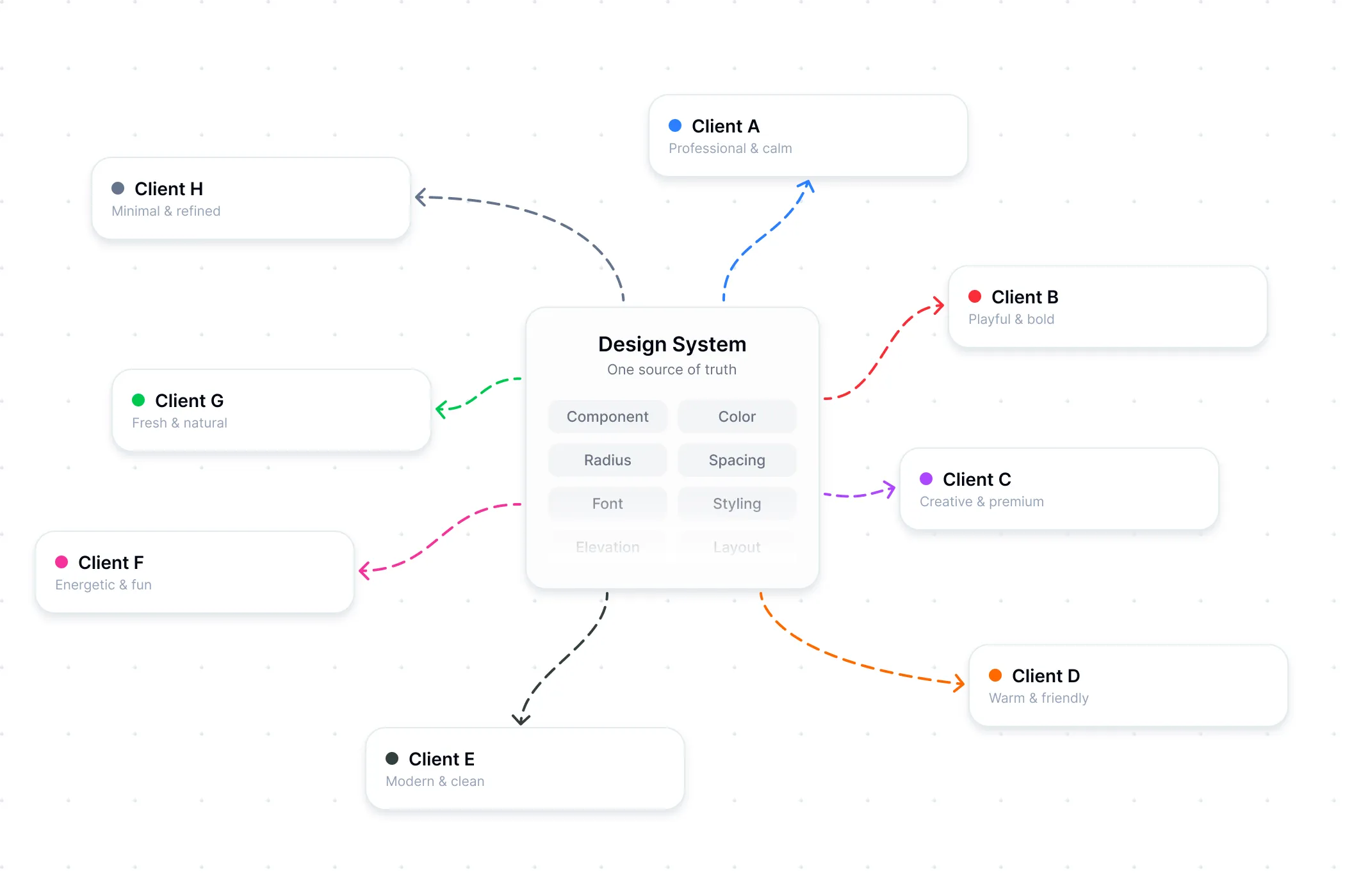 One foundation, extended and restyled to fit each client
That is where the idea of an extensible design system came from. For me, it means building a reusable system where the component logic stays stable, while the visual language can shift depending on the client. The same structure can support different colors, typography, spacing, corner radius, and overall feel without losing consistency.
Why I’m developing it?
Working with multiple client is never only about speed or only about customization. Before I developed this approach, I often found myself wasting time recreating components I already understood simply because each client needed a different visual direction.
That repetitive setup slowed projects down and pulled attention away from more important work, like understanding the product, improving the user experience, and shaping a clearer brand identity.
An extensible design system helps solve that problem. It gives me a reliable starting point, so I am not rebuilding the basics every time. More importantly, it gives me more room to focus on the parts of the design that should be unique: the character of the brand, the tone of the interface, and the details that make the experience feel intentional.
In other words, it helps me move faster without making the work feel generic.
The Concept
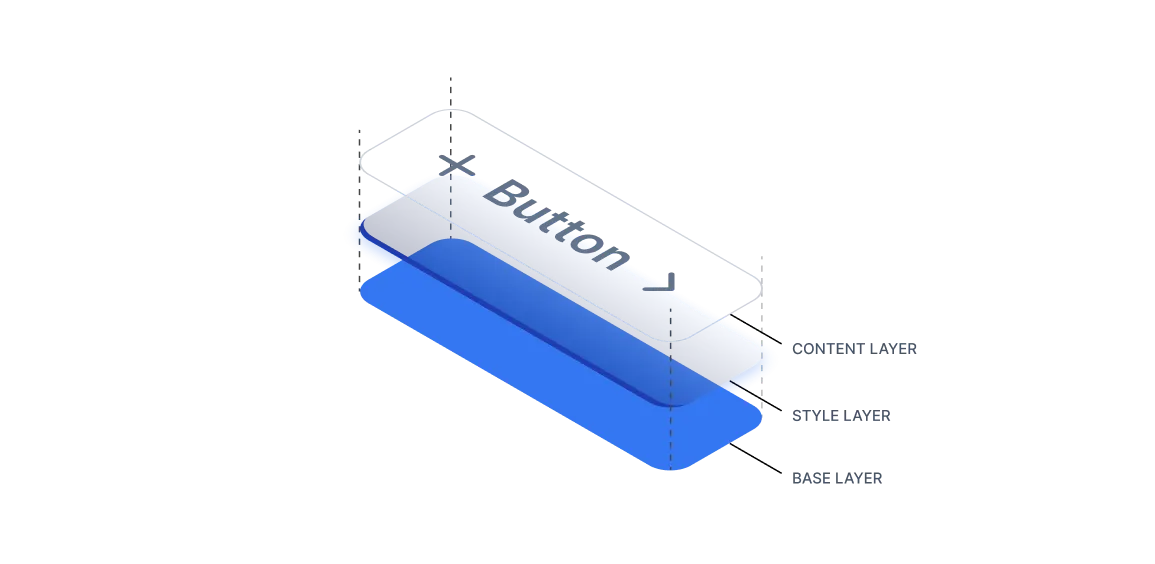
The concept is simple, but it changed a lot in my workflow: separate structure from style.
The component itself should handle the structure, behavior, and states. A button should still behave like a button. A card should still follow the same logic. A form field should still have the same functional foundation. Those parts do not need to be reinvented every time.
The style, however, should remain flexible. This is where Figma variables became especially useful for me. At first, I saw variable modes mostly being used for light and dark themes. But the more I explored them, the more I realized they could support something much broader.
Instead of only switching themes, variable modes can also shift the entire feel of a system. They can change brand colors, typography rhythm, spacing density, border radius, and other visual properties that give a product its personality. That means one component system can support multiple visual outcomes without changing its structural core.
This is what makes the system extensible. The same component foundation can serve different clients, while still allowing each one to feel distinct.
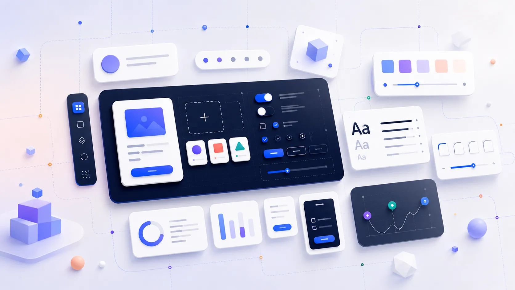
How it works?
The workflow starts by bringing the design system library into a new project. From there, the focus is not on rebuilding components, but on adjusting the styling layer that drives them.
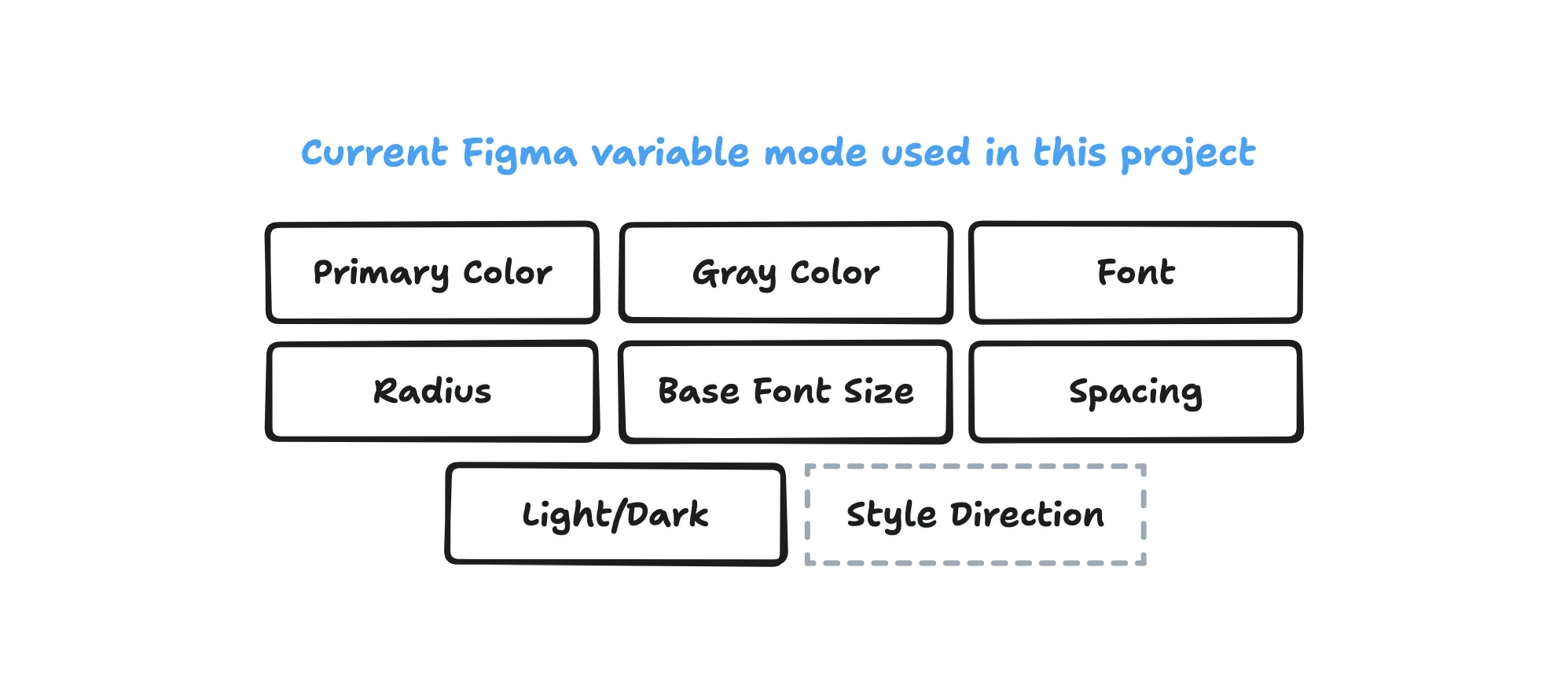 The current token setup covers the main visual foundations, with room to expand into broader style direction later.
That styling layer is made up of tokens and variables. These tokens define the visual rules of the project, such as color, typography, spacing, and shape. Once those values are updated to reflect the client’s brand, the components connected to them begin to change automatically.
This makes the process much more efficient. Instead of redesigning each component one by one, I can shape the overall system by updating the variables behind it. A project can become more minimal, softer, bolder, more compact, or more expressive without requiring the entire system to be rebuilt.
What I like most about this approach is that it gives me both stability and flexibility. The components remain dependable, but the design still has room to respond to the client’s needs and identity.
You can try the current live version here.
Future Concept
Lately, I have been thinking about the limits of token-based styling and what might come next. Tokens are powerful, but there are some visual ideas that are harder to express through them alone. Things like gradients, layered surfaces, richer elevation styles, or more decorative treatments often need another level of control.
 A possible next step is adding a style layer above the token foundation to support richer visual direction.
Because of that, I have started exploring the idea of adding a style layer on top of the token layer. The goal is not to replace the existing system, but to extend it further. I want to keep the clarity and maintainability of a token-driven structure while allowing for more advanced and expressive visual direction.
This is still an evolving idea, but I see strong potential in it. If done carefully, it could make the system even more adaptable, especially for clients who need a more distinctive visual identity without losing the benefits of a shared foundation.
Bottom Lines
This extensible design system has changed my process in a very practical way. What used to take weeks of rebuilding can now be reduced to a much shorter and more focused setup phase. But beyond the time saved, the biggest shift is where my attention goes.
Instead of spending energy recreating the same UI foundations, I get to spend more time on the parts of design that actually need thoughtful decisions. I can focus more on product problems, interface clarity, and brand expression, while still working from a system that is consistent and scalable.
For me, that is the real value of an extensible design system. It is not only about efficiency. It is about creating a better balance between reuse and creativity, so each project can move faster while still feeling intentional and unique.